

Case Study: Redesign UTS app
The goal of the project is to address the user problems and improve the overall experience of the UTS app.
MY ROLE
UX research
Interface Design
Usability Testing
Prototype
DURATION
TOOLS
March- April
2023
Figma
Design Challenge
How might we provide the quickest and seamless ticket booking experience to commuters?
Background

Locals are the lifeline of Mumbai.
Lakhs of people travel regularly and commute by local trains.
While the number of daily commuters are increasing every day, the number of railway ticket counters are static. This means long queues at each counter leading to delay and frustration among people.
User Research

UTS app by CRIS (railway authorities) is Indian Railways official mobile app to book tickets via phone, skipping long queues at railway counters.
Ratings & Reviews


Analyzing User Problems
After analyzing reviews on play store and conducting user interviews, I considered three main components for negative user experience
Lengthy steps & Cluttered home screen
No Download ticket or easy show ticket option
Unclear and ambiguous error message
Coming up with Solutions
I sketched out main wireframes and conducted a usability test to get the feedback from users and iterate on my designs further. On the basis of feedback, I changed layout of certain pages of my designs to make it more user centric.
Before Usability test

After usability test
Digital Wireframes


Results
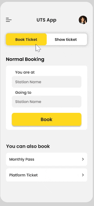
01. Cluttered home screen and multiple logins
UTS app has multiple options available within little space making it look congested and cluttered. Also, the app asks for login every time a user is booking a ticket, causing delays and frustration.


Current App home screen.
As the solution, I reduced the options on homepage to 3 and included the rest in the hamburger menu. Also, I included a single sign-on to shorten the user flow.


02. Error Message
The app requires location access to prevent users from booking tickets within the station premises. However, users can still book tickets using the QR code at the railway station. This feature is not familiar to many users, which causes frustration.
My solution is to provide an actionable error message which conveys the problem clearly and provides a clear solution to the user from there on.

OLD
Informing the problem to the user in simple and clear words.
Indicating the problem at the homepage itself rather than at ticket summary page
Providing an actionable solution to the user for the informed problem.

NEW
03. Ticketing Options
The current show ticket option only works with good internet access, which is not always available during travel. This causes inconvenience and frustration for users who cannot show their booked tickets to the Ticket Checker.

Ticket Summary

Booked Ticket

Home Screen
My solution consists of two features: a quick show ticket option on the homepage that enables users to display their tickets without internet access, and a download ticket option.

Ticket Summary

Booked Ticket

Home Screen
Final Look
User Flow

Conclusion
Key Challenges
-
Understanding diverse group of commuters.
-
Although, the language used by people in Mumbai is very friendly, it was difficult to replicate the same in the app since it was a government app.
Learnings
-
Feedback and Iteration are a part of every stage in the design process.
-
Even small inconsistencies in design w.r.t alignment or font, make a major impact on the entire experience.
Next Steps
-
Sketch & prototype the rest of the screens for other ticketing option
-
Conduct 2nd round of Usability test and iterate on designs as per feedback received.