Redesigning the Landing page of camping website in 5 days
Summer camps for kids made fun!

Timeline
12-17 August 2023 (5 days)
My Role
UX Research & UI Design
Team
Internship Project
Overview
Designing a landing page...
Inme is an organization that provides summer camps for teenagers held in natural settings. With a rich history of delivering premium camping experiences and a team of top-class instructors, Inme empower teenagers through adventure-based programs.
I developed this project during my internship at Skillto, where the task was redesigning an organization's landing page to address both user needs and business objectives.

I won project of the month award for the landing page design. Here are some key achievements:
-
Designing for all devices: Designing responsive websites adaptive to all types of devices was a task at hand.
-
Timely completion of work: We had to complete the project within a week, including screens, style guide and present our case study explaining reasons clearly.
-
Won the design award: While being able to submit the project on time seemed like a big achievement, winning the certificate is definitely a happy moment.
Day 1- Define
The challenges of the existing platform
By conducting research about user behavior, collecting data and studying other travel websites, I realized users' drop off points. The major issues faced in the website:
01. The landing page is oversized, with an uneven mix of images and text.
02. The existing landing page did not effectively capture and hold the attention of users.
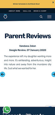
03. The existing landing page was not optimized for mobile.
The first stage of the project was to understand the website in detail and understand the user pain-points by going though the user flows. The best and the worst of the website was recorded in an excel sheet.

Here are a few screenshots of the desktop and mobile phone version of the website.


Day 2- Empathize
Personas driving our Camping adventure
To display a good understanding of user needs and pain points, I came up with two distinct user personas. These personas represent two key user groups: parents of young teenagers and the teenagers themselves.
Persona 1: Outdoor Enthusiast Kaira's Mom

Priya Mehra
Age: 38 years
Family: Mother
Income: ₹5-10L
“It is important for kids to see the world beyond the four walls.”
Core Needs
Finding an outdoor adventure program for her kid.
Ensure the program is safe and supervised
Pain points
Not tech-savvy.
Finds it difficult to trust campers for kids safety.
Persona 2: Adventure Seeking Rushang

Rushang B.
Age: 17 years
Family: Parents
Class: 11th std
“I want to learn outdoor skills and make new friends along”
Core Needs
Find exciting and challenging camping experiences.
Connect with like-minded peers.
Pain points
Becomes frustrated with non-mobile-friendly websites.
Finds difficult to convince parents for trip.
Day 3- Ideate
How do we make this better ?
After obtaining a good understanding of user problems, I moved to defining MVP solutions on the basis of insights we came up with previously:
01. Use clear and friendly buttons that encourage users to sign up for camping.
02. Simplify the content on the landing page by making it easy to skim through.
03. Making the website fully responsive, ensuring it functions well on all devices.
After defining the solution. I quickly sketched out ideas using Crazy 8's exercise. The idea was to come up with as many possible ideas as possible without giving focusing on any single idea. Here are the hand-drawn sketches-


This is how the early wireframes looked like. On the left, I first mapped out the purpose of each section, to guide for our wireframe designs. The primary goal is to prompt users to select interested camp.


I then turn these early ideas into high fidelity designs. We used this design to kickstart the user test, so we can learn what people think about the landing page. The mantra is to fail fast to learn fast.

Day 4- Usability testing
3 major improvements in my design
I conducted usability testing of the prototype. I incorporated modifications based on insights from 5 user tests and guidance from my mentor. Here's a walkthrough of what I improved post-testing :
1
-
I addressed text readability issues by adding a gradient to the card design.
-
Improved program clarity by including brief subtext descriptions based on user feedback.


Making it accessible.
Old
New
2
-
Many users couldn't find the action button, so I added a CTA button and a secondary button for better clarity and improved conversion rates.


Clear CTA button
Old
New
3
-
Based on my mentor feedback, I enhanced the overall website by integrating the primary colors of the website into the design elements. Here is one such change.
A Better UI


Old
New
Day 5 - End results
Final Designs
Enhancing the first impression
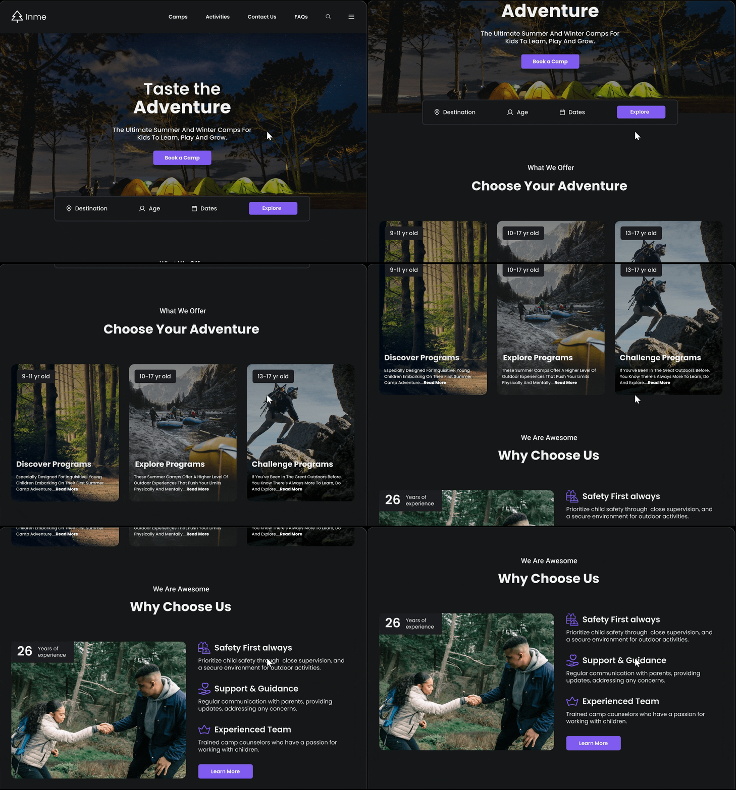
Showcase an appealing banner and services head on to generate excitement. Using dark theme to convey the premium nature of Inme camps. Convey our best features head on to generate maximum impact.

Optimize camp registration
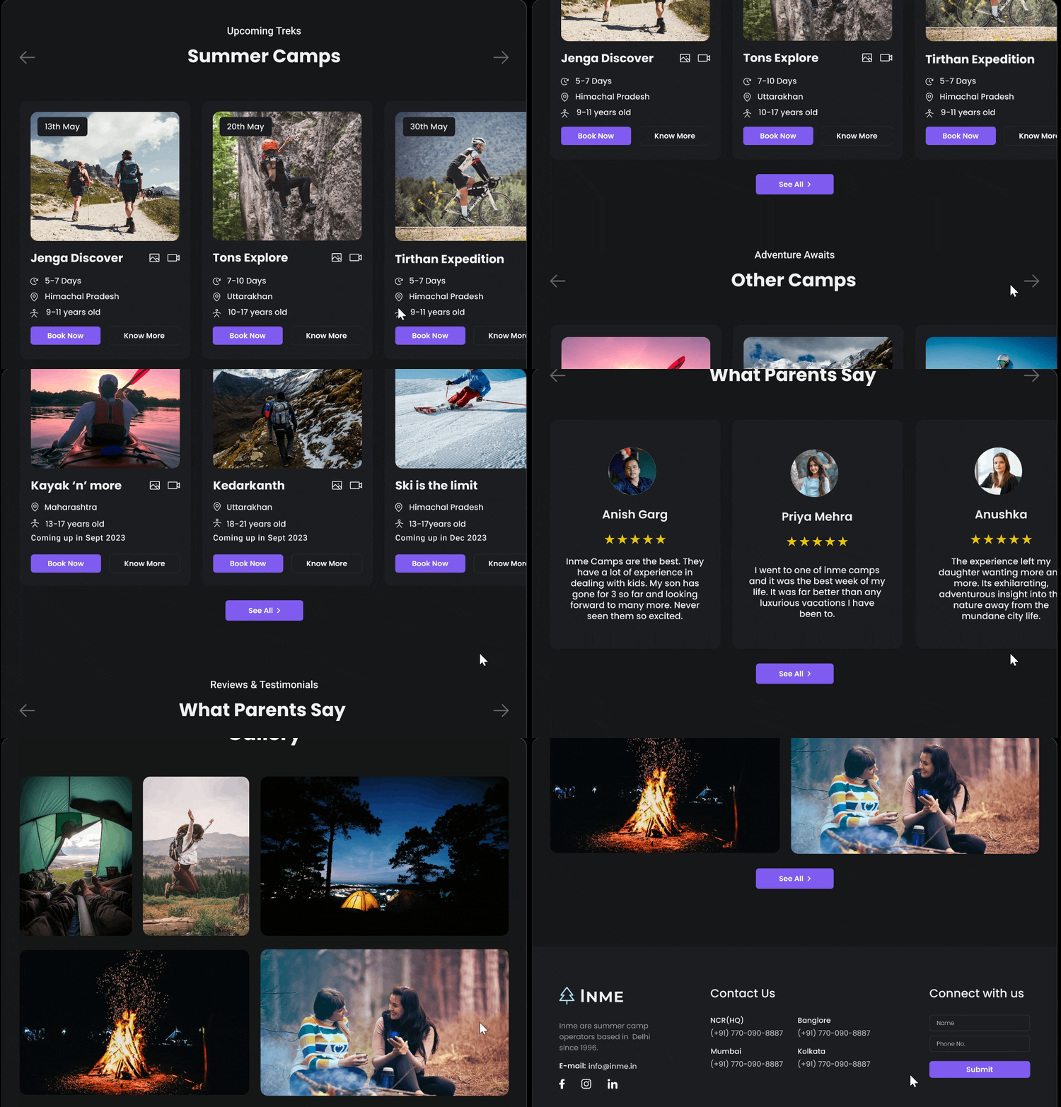
Focusing on key camping info and register CTA in strategic places throughout the website to encourage maximum camp registrations and generate maximum impact.

Designing for all devices
Ensure that the landing page is fully responsive and optimized for various screen sizes, including smartphones and tablets, with concise and scannable content.


Results & Takeaways
What I would do differently next time...
I was able to complete this project within a week and deliver a presentation on the same. While receiving appreciation for the project was amazing, here are certain key takeaways and learnings from this project:
01. Recognizing the scientific aspect of UI design alongside its artistic dimension.
02. Prioritize design planning to ensure timely project completion.
03. Use feedback and iteration for amazing user experiences.